Toast POS redesign · Food & drink
A point of sale that holds up during the Friday rush
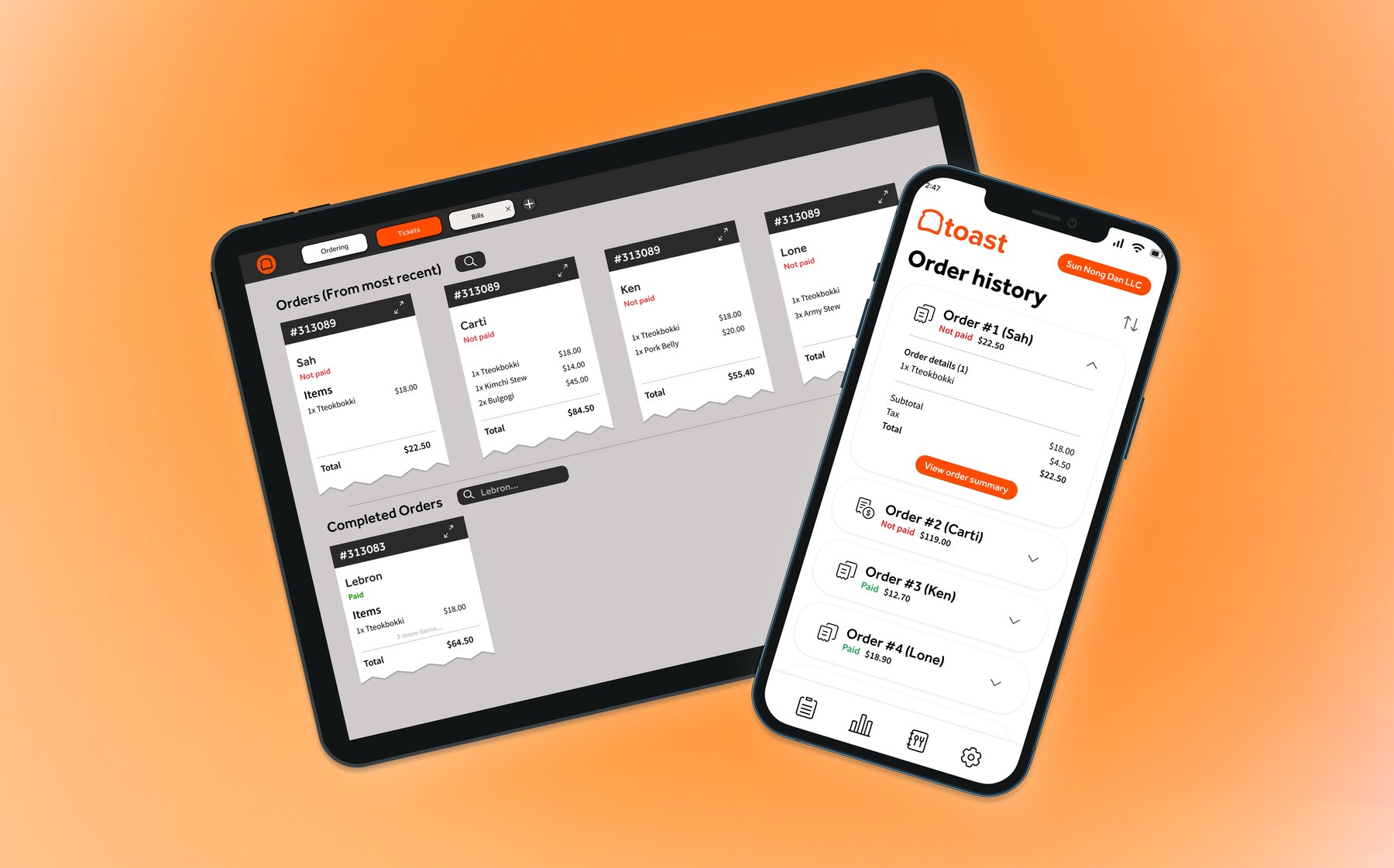
I led mobile design on a Toast POS redesign for small food and drink businesses, replacing the spreadsheets, texts and whiteboards staff fall back on when their system fails.
Problem
When the POS crashes mid-rush, staff switch to manual workarounds that slow service and lose revenue.
What I did
Interviewed four local businesses, audited four platforms, and designed the handheld flow from orders to payment.
Key insight
82%
had a POS issue in the last two weeks
01Challenge
In food and drink, every second counts. One crash during a rush means a line out the door and a spreadsheet nobody trusts.
Unreliable systems, whether a Square reader that freezes or a platform with little automation, push small teams into slow manual processes. That hurts service at peak hours and adds stress about lost sales and burnout.
Our goal was a POS that's reliable under pressure, quick to learn, and flexible enough to grow with the business.
02Research
We started with the people behind the counter
We interviewed owners and staff at four San Diego food and drink businesses about their tools and their busiest hours.
Boba tea shop
Camellia Rd Tea Bar
Frequent Square malfunctions force manual inventory tracking and workarounds.

Pop-up matcha bar
Mix + Matcha
The iPad POS crashes during rushes, so staff switch to slower phone payments.

Local brand
Gleem Energy
Shopify's limited automation creates labour-heavy processes and slow handoffs.

Coffee shop
Friends of Friends
Equipment checks and scheduling live on whiteboards and paper lists.
82%
reported a POS issue in the last two weeks
77%
wanted better order organisation
3 of 4
businesses only take contactless payments
“Square just stops working pretty often.”Owner, Camellia Rd Tea Bar
Four patterns kept coming up
01
Unpredictable failures
Crashes at peak hours mean long downtime and slower workarounds.
02
Manual workarounds
Google Sheets for inventory, text messages to coordinate orders.
03
Disconnected tools
Owners want orders, tasks and device handoffs in one place.
04
Room to grow
A system that scales with demand and automates more over time.
03Platform audit
Why we built on Toast
We benchmarked the four platforms our interviewees used or considered. Each one centralises services, but none is both flexible and easy to use. Pick a platform to compare.

Strengths
- Restaurant-focused
- Robust features
- Hardware and software bundles
- Durable hardware
Weaknesses
- Expensive for small businesses
- Limited flexibility outside restaurants
- Proprietary hardware
- Inconsistent performance
Why it's our base The strongest foundation for food service. The gaps are usability and flexibility, which is exactly what design can fix.

Strengths
- User-friendly
- Affordable
- Integrated tools
- Accepts all forms of payment
- E-commerce support
Weaknesses
- Limited scalability
- Rigid structure
- Internet-dependent
- No support for high-risk merchants
Takeaway Easy to start with, but it's the system our interviewees said breaks during a rush.

Strengths
- Flexible POS solutions
- Standalone system
- Third-party apps
- Reward programs
Weaknesses
- Complicated customisation
- Steep learning curve
- Geared towards larger businesses
- Limited e-commerce support
Takeaway Flexibility only helps if a small team can actually set it up.

Strengths
- Ideal for e-commerce
- Cloud-based
- Optimised performance
- Portable
Weaknesses
- Premium pricing
- Network-dependent
- Requires permissions
- Large catalogues slow the hardware
Takeaway Built for online stores first, which shows behind a busy counter.
| Feature | Square | Clover | Shopify | Toast |
|---|---|---|---|---|
| Customisable layouts | ✕ | ✓ | ✓ | ✕ |
| Mobile app | ✓ | ✓ | ✓ | ✓ |
| Real-time reporting and analytics | ✓ | ✓ | ✓ | ✓ |
| Inventory management | ✓ | ✓ | ✓ | ✓ |
| Third-party app integration | ✕ | ✓ | ✓ | ✕ |
| Offline mode | ✓ | ✓ | ✓ | ✓ |
| Online ordering and e-commerce | ✓ | ✕ | ✓ | ✓ |
| Customer feedback collection | ✕ | ✓ | ✓ | ✕ |
| Employee management | ✓ | ✓ | ✓ | ✓ |
Toast's gaps, highlighted, pointed us to customisable layouts, which became the tabbed order views below.
04Personas
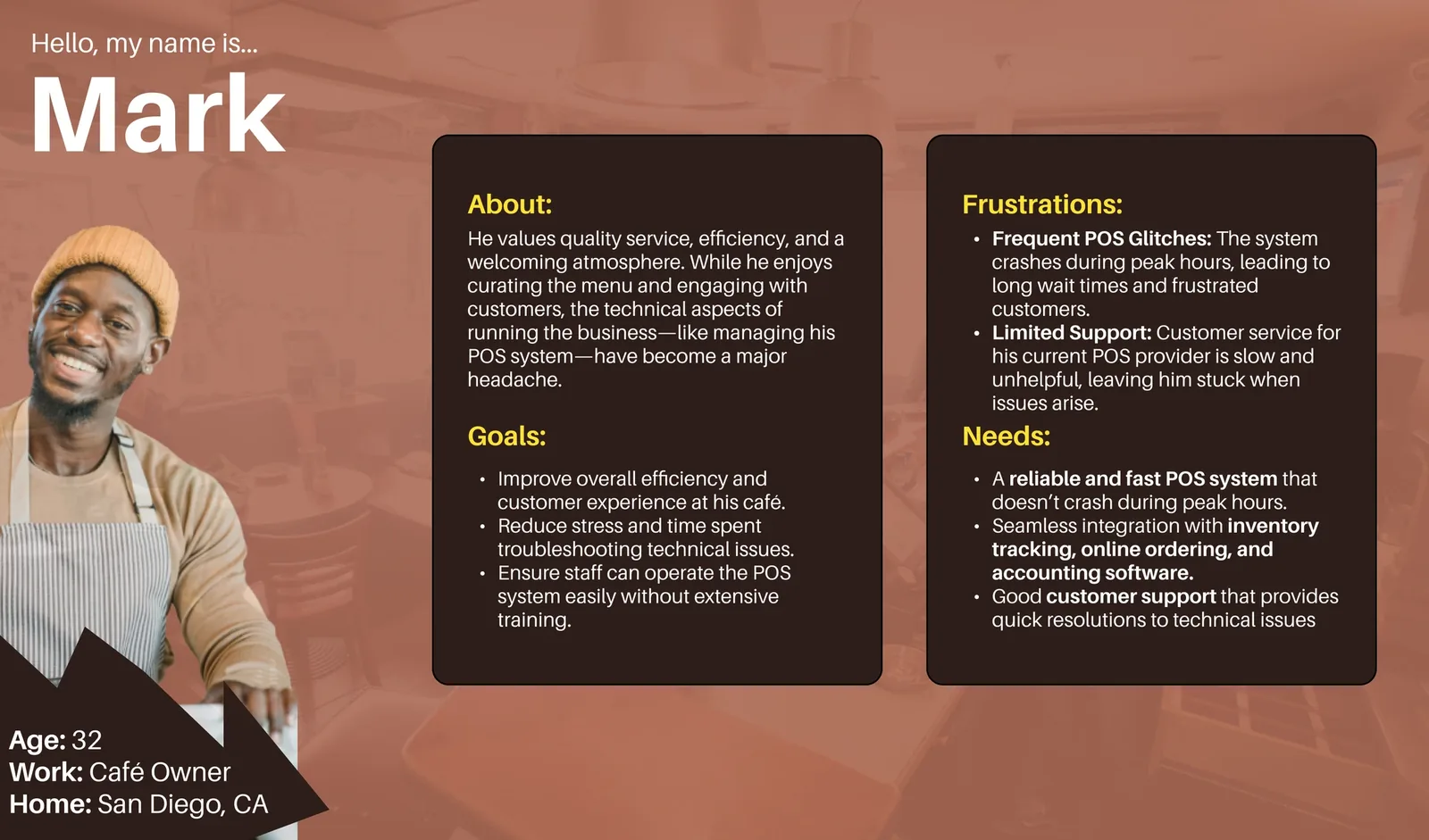
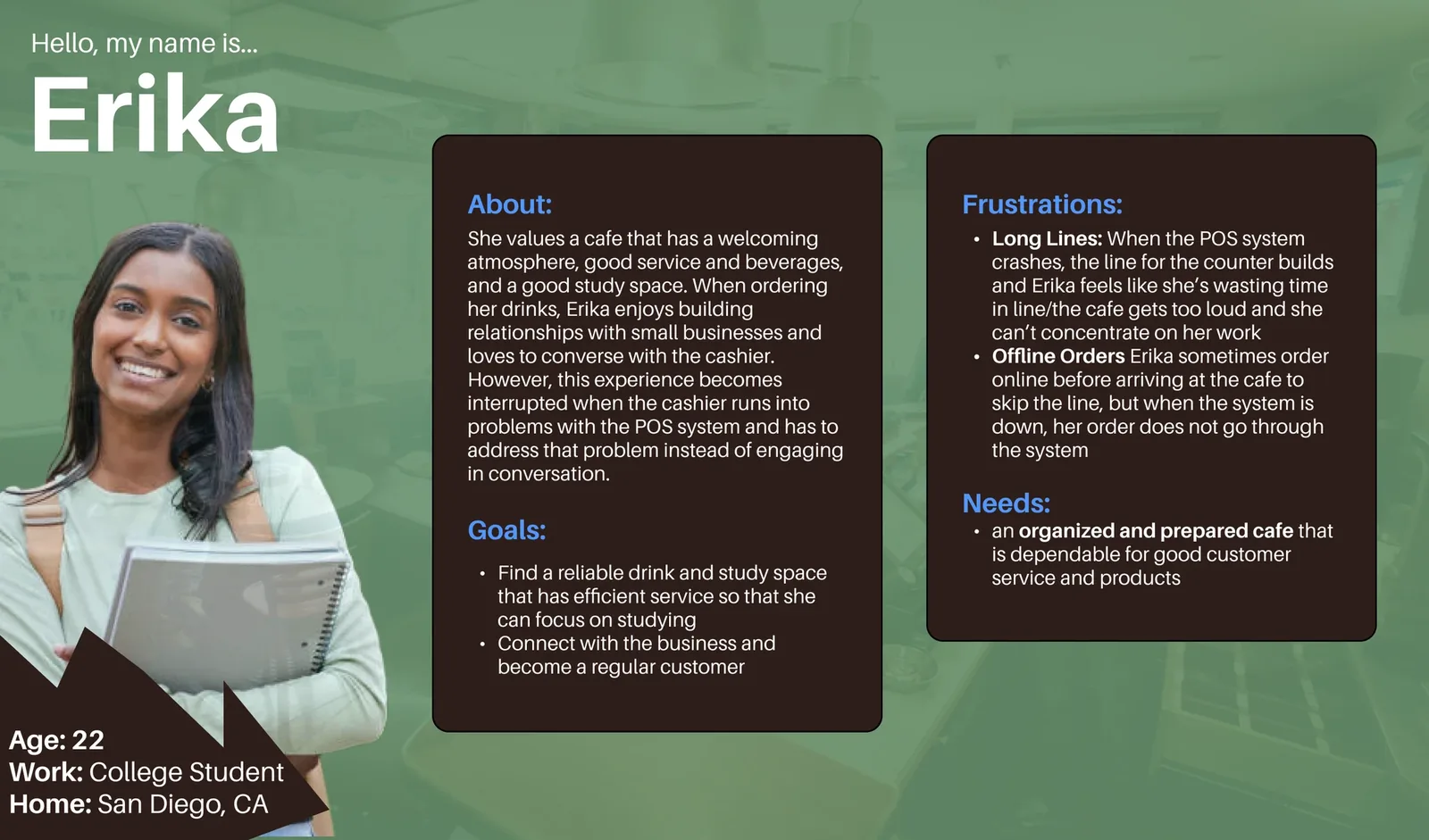
Two sides of the same counter
Every order has a customer waiting and a team trying to keep up. We designed for both.
05Process
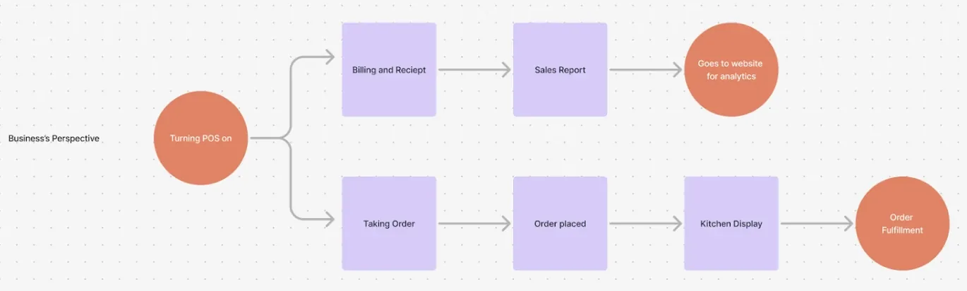
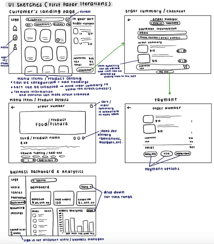
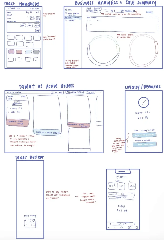
Mapping the rush
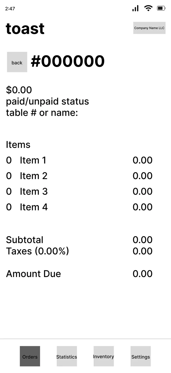
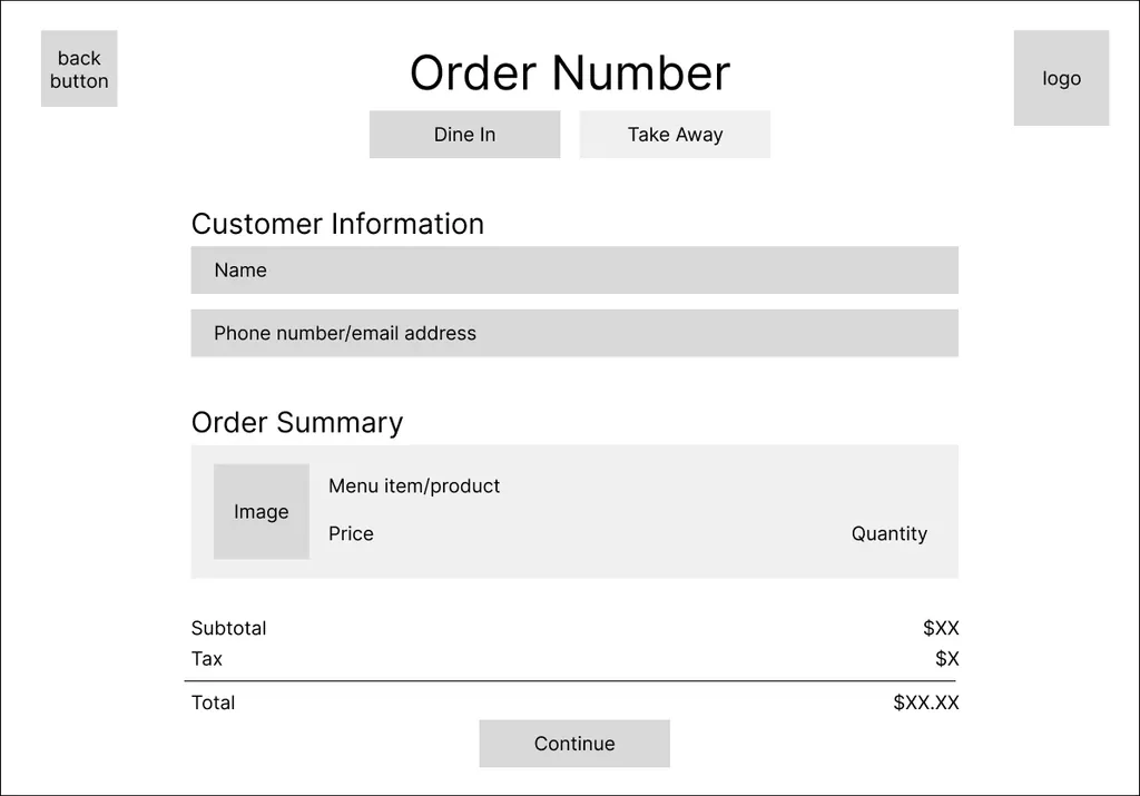
We mapped the two flows that matter most at peak hours, then sketched and prototyped them at low fidelity.

06Iteration
From scrolling fatigue to tabs
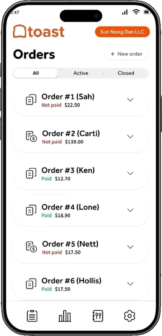
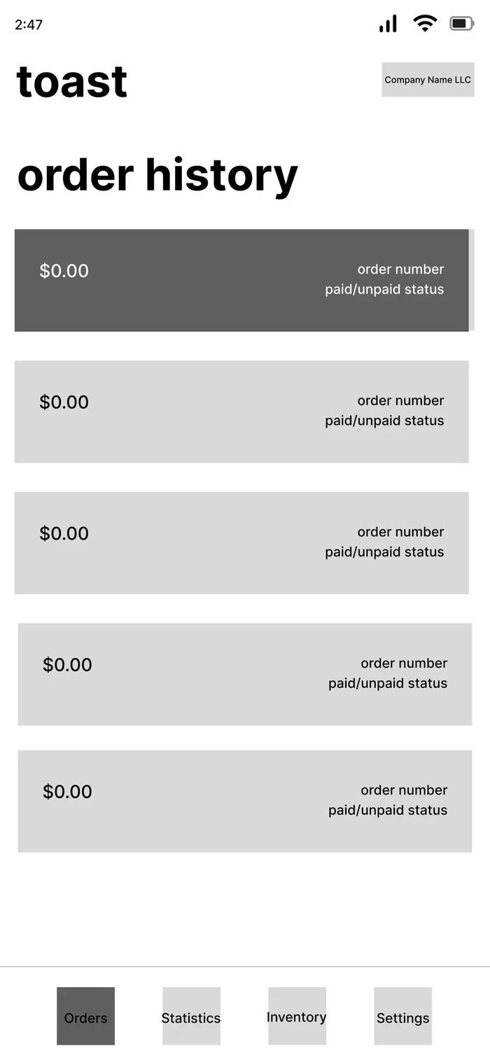
Our first handheld relied on a long list and a "Sort by" button. Heuristic reviews and owner testing flagged scrolling fatigue and information overload. Toggle to see what changed.
Hi-fi, after testing
Status at a glance
- All, Active and Closed tabs replace "Sort by", so staff stop scrolling
- A prominent New Order button for walk-ups
- Paid and Not paid in consistent colours, with names and totals on every card
- Clean cards instead of receipt-style edges, closer to Toast's brand
Lo-fi, first round
One long list
- Every order in a single scroll
- Status hidden in small text on each row
- Sorting behind a button staff didn't find mid-rush
07Solution
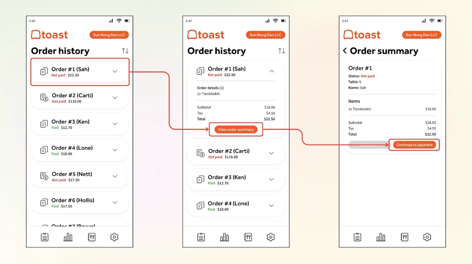
Handheld, for staff on the floor
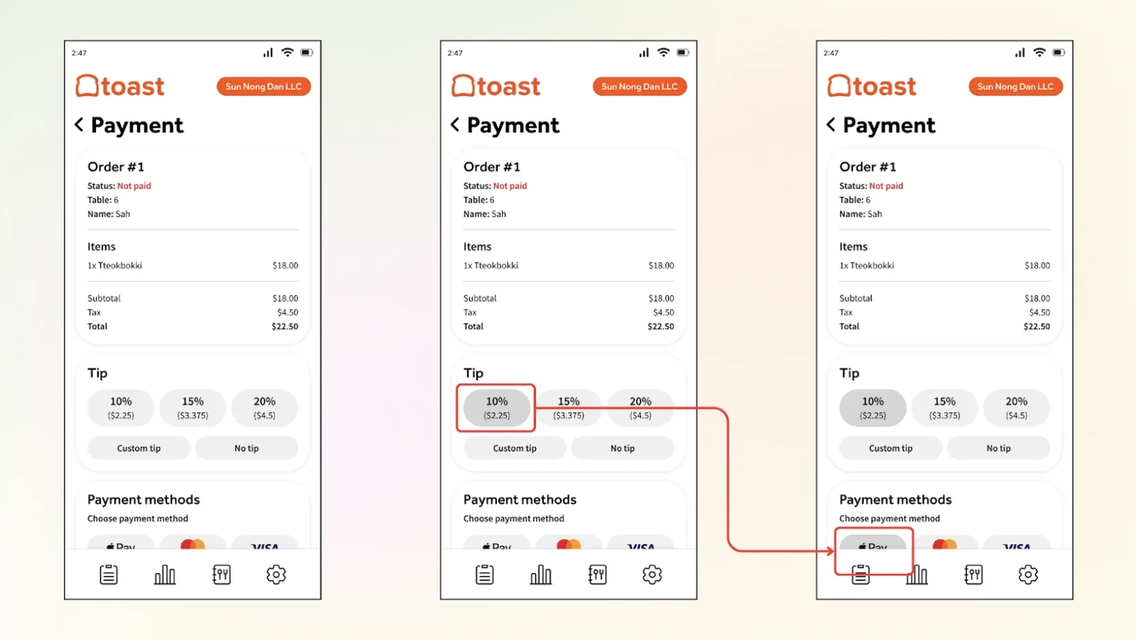
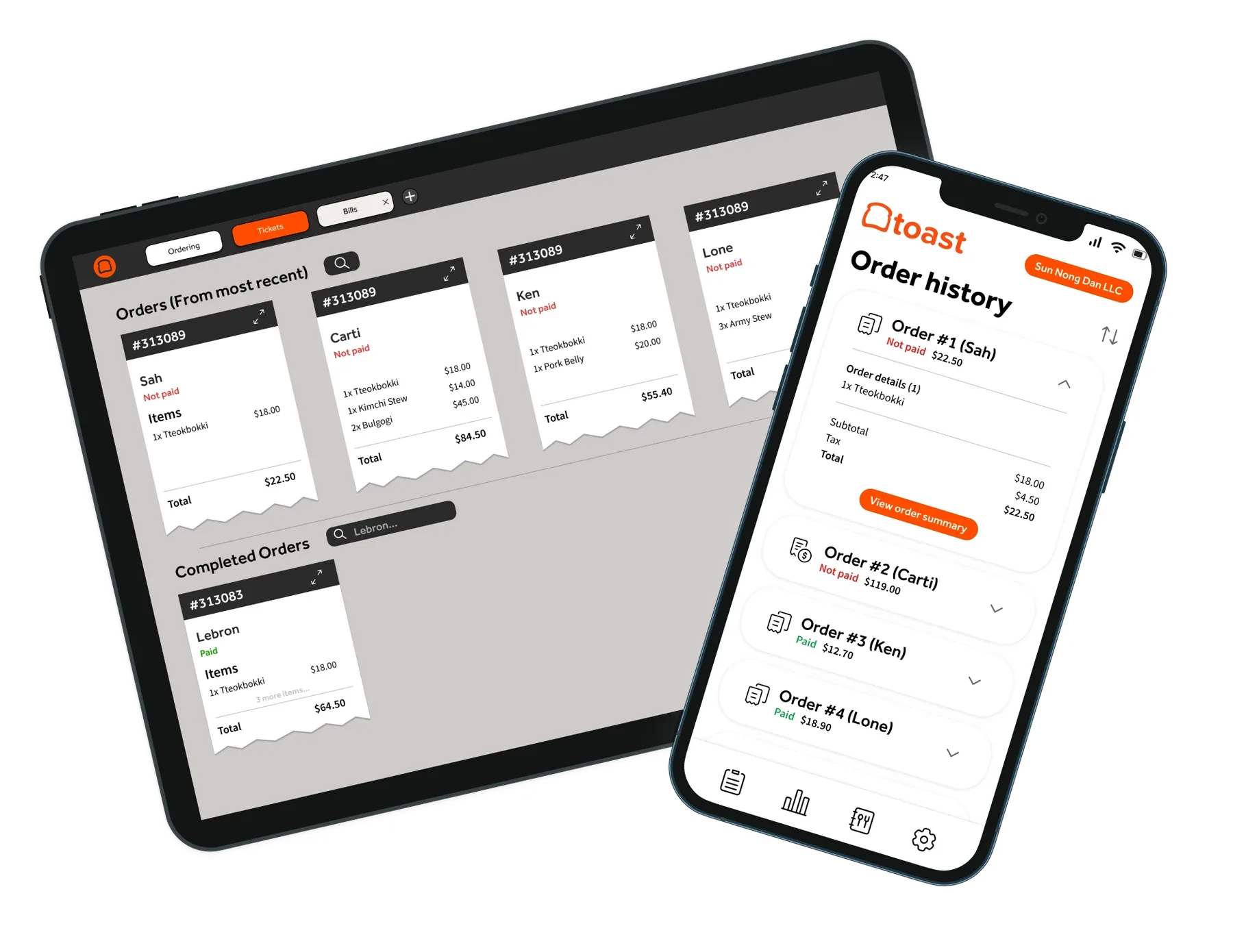
I designed the handheld around a server mid-shift. Step through the flow below.
08Outcome
What the redesign is built to do
Faster under pressure
Fewer manual steps, so staff process orders quickly even mid-rush.
Decisions on the fly
Owners see orders and revenue in one place instead of a spreadsheet.
Grows with the business
Customisable views that adapt as menus, teams and volume change.
09Reflection
This project showed me how much iteration matters. Bringing owner feedback into every round taught me to balance creative ideas with what actually works behind a busy counter.
Thanks to Ryan Eang, Zander Vilaysane and Ashley Nguyen, and to Camellia Rd, Mix + Matcha, Gleem Energy and Friends of Friends for their time.
Next project
Growin'